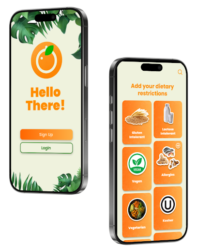

Shown above: Two screens from the app, and the app's logo.
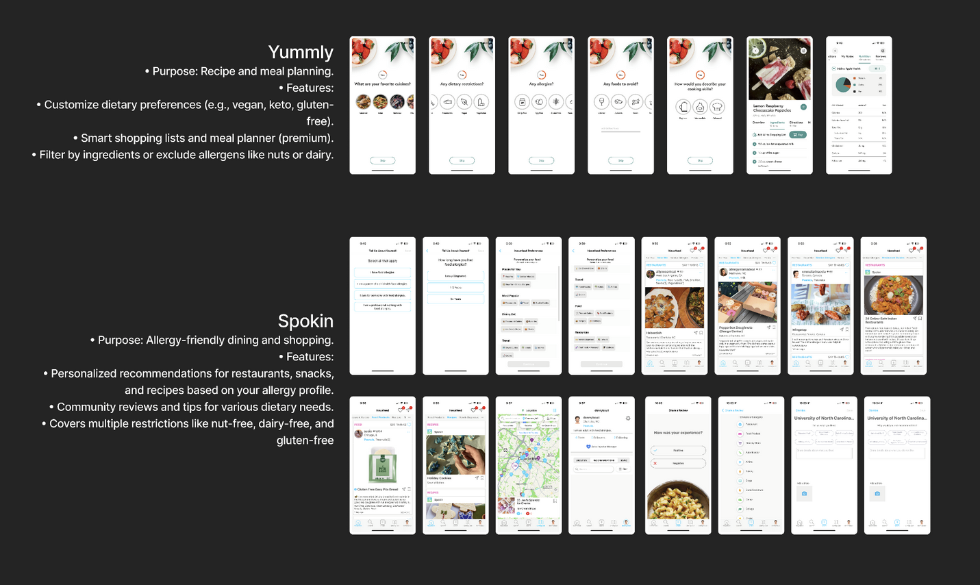
First, our team started with competitive research. We choose two of our biggest competitors, Yummly and Spokin, to analyze and evaluate. With our research, we took a close look at these app's user experience, interface patterns, and features. The purpose of this research was to identify the industry standard, gain inspiration, and opportunities for differentiation.
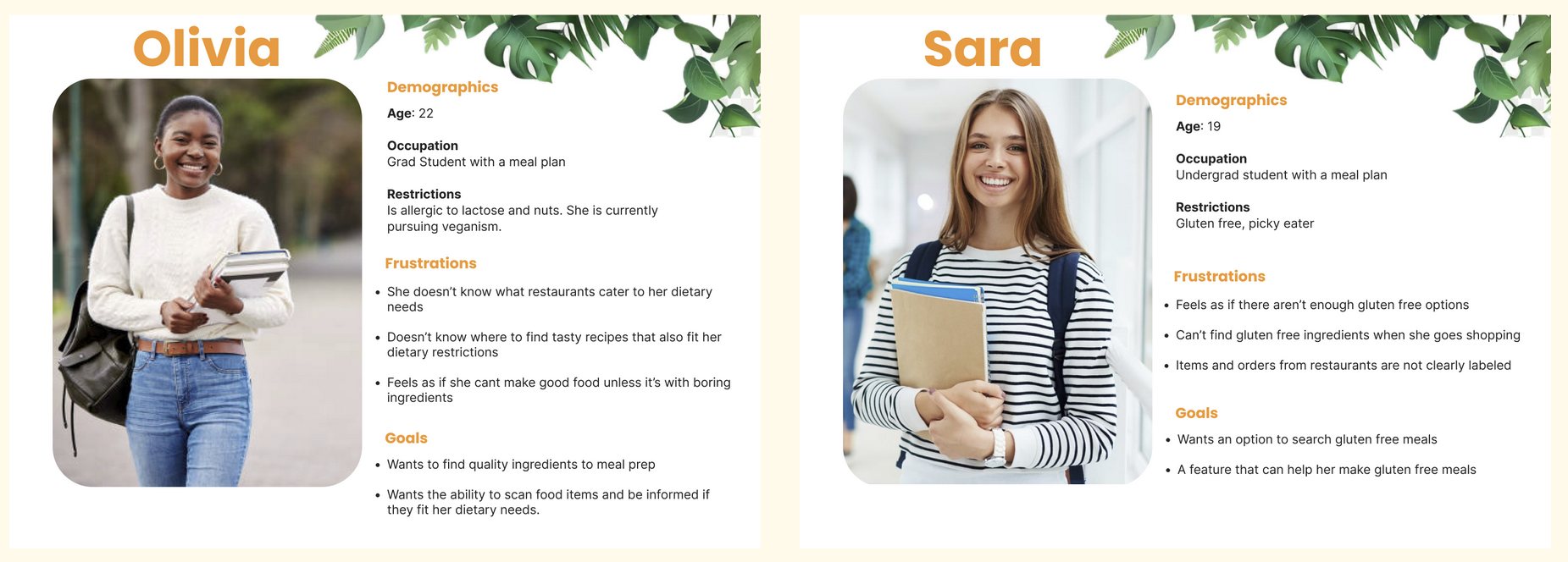
Our team then created user personas, Olivia and Sara. These user personas helped us make our design decisions, helped map out our user journeys, and allowed us to emphasize with our target audience.
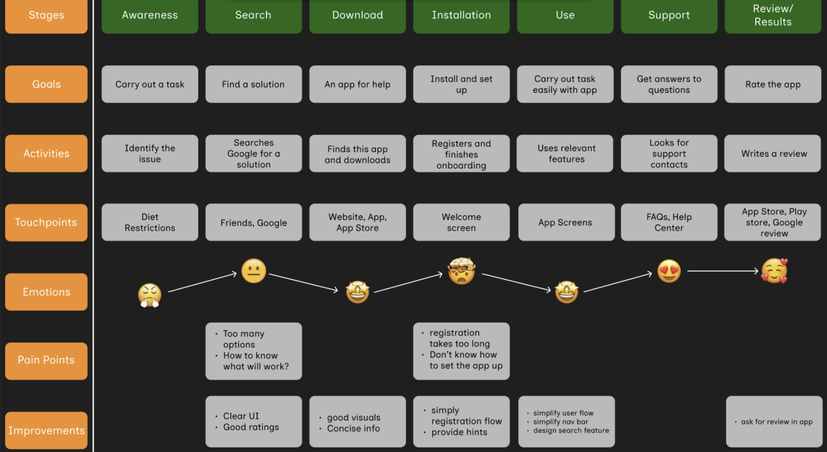
Shown above: Our User Journey Mapping process.
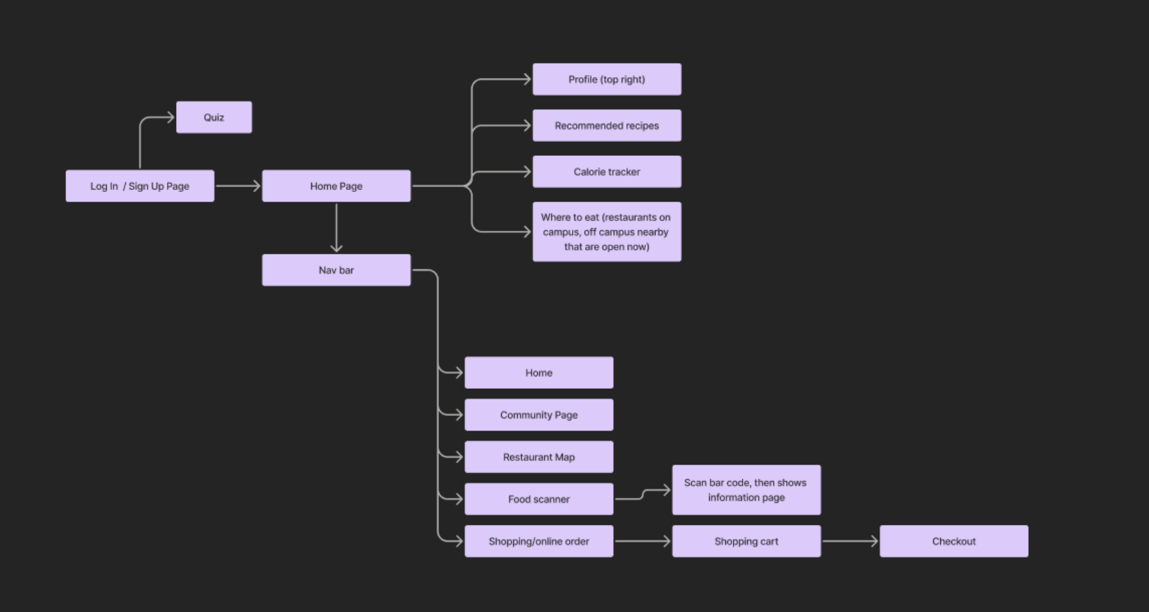
Shown above: Our Information Architecture (IA) mapping.
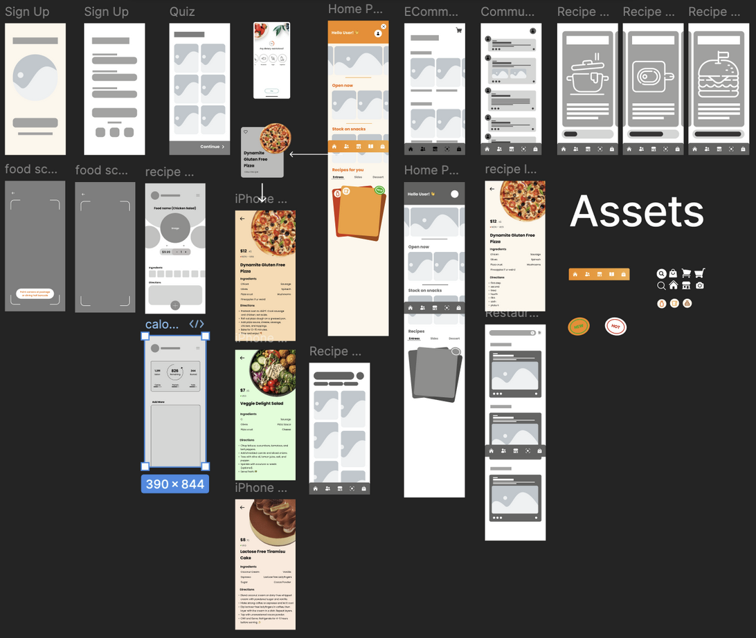
For the low-fidelity phase, we each created basic wireframes to visualize the structure and layout and later put them together to make one cohesive lo fidelity. These wireframes allowed us to quickly iterate on concepts and gather feedback from each other early in the design process. This approach ensured we aligned with user needs and project goals before investing time in high-fidelity designs.
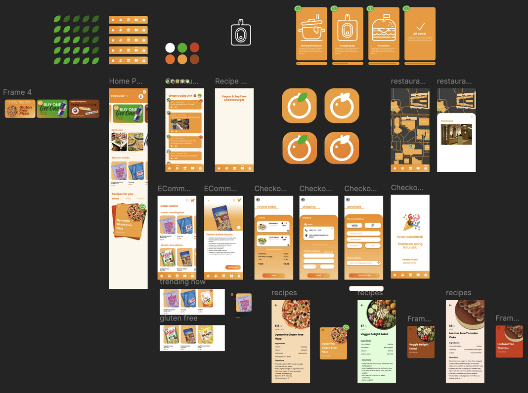
Shown above is our first iteration of our hi-fidelity for the app. For this step, we collaboratively integrated of all our lo-fidelity designs and added our brand colors, fonts, images, etc.
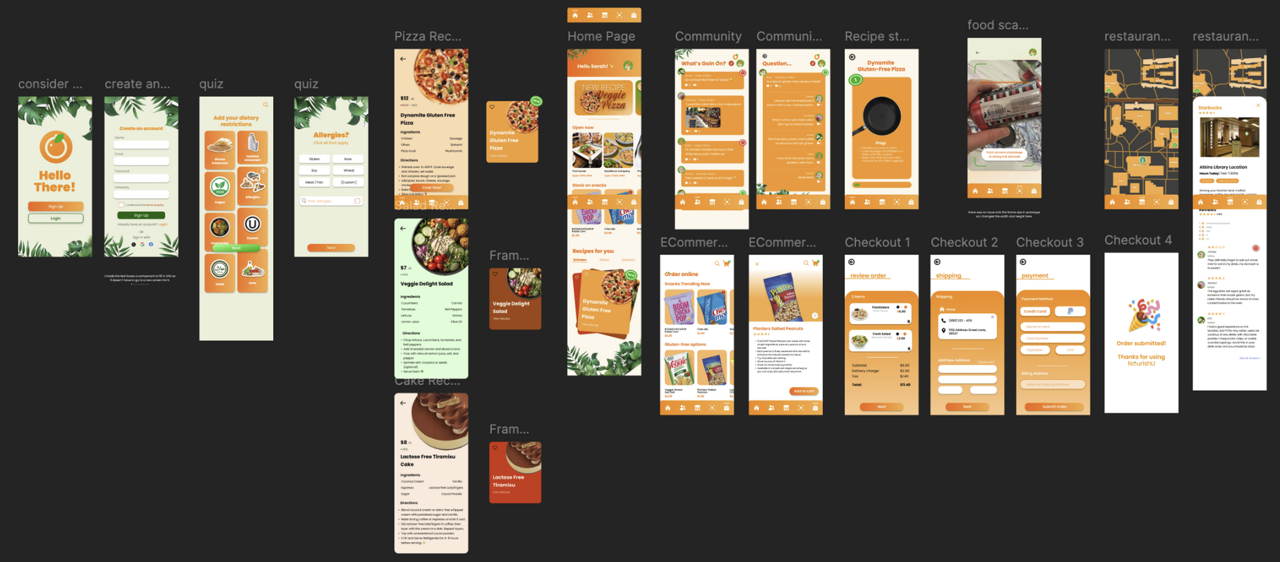
To finalize our second hi-fidelity, we used collective feedback that we had given each other during the initial design phases and built off it to finalize our design. We cleaned up the design of the app, added several new screens (such as a barcode scanner), and completed the prototyping.
Shown above: Final product demo.